Don Satijn
kunstinzicht.nlA concise survey of the works of Don Satijn
By Marcel Teunissen, art historian
Form and meaning, chaos and harmony, the finite and infinity
Those who simply want to enjoy the works of Rotterdam artist Don Satijn (1953) are cordially invited to do so. Although the artist would appreciate some research on the part of the viewer, or at least some form of reflection incited by his work, the two- and three-dimensional works of art are extremely pleasant and fascinating to watch as such. Some objects induce a sacral reading, the formally more complex works intrigue, because the observer may see ever changing figurations in them (and in some cases may actually be able to alter them himself). According to Satijn his work is open to individual interpretation.
The forms of his objects are the result of a carefully conducted and consistent designing and manufacturing process. The works themselves obviously don’t tell that story. They are aesthetic objects, harmonious compositions and – for whoever is willing to put some power of imagination into it – they give expression to concepts like the finite and infinity.
Thus, for Satijn form is not the result of a preconceived choice. Form is the result of a process that is characterized by drudgery (some thoughts about the starting point, but above all manual labour), if necessary by applying mathematical order and selecting on the basis of aesthetic and personal criteria. They are not the result of formalism nor are they finger exercises in the material capacities of, for instance, concrete. In essence – and that is another facet of art besides aesthetics – Satijn’s work concerns itself with life, with human insignificance, with the inability to make a visualization of unlimited variations.
Again, it is perfectly legitimate to attribute contemplative qualities to Satijn’s works, but the artist himself has a story to tell which transcends the commonplace. This story is his driving force. Don Satijn: ‘Life is so complex that we can never fully fathom it. One can never really visualize it in art, but it motivates me to make my works as I do. The Japanese scientist Masaru Emoto has conducted remarkable research in this area. He has proven that positive thoughts and words have an effect on the microstructure of the element water, so the ice-crystals of the affected water turned out a much more regular pattern. What fascinates me in this story is that in its most simple approach harmony leads to harmony.’
Harmony is an important concept for Satijn, who often commissions works for himself: can I prove that an (apparently) random pattern of forms will result in harmony? By taking selections from series of formal variations, which rapidly transcend our powers of imagination, Satijn’s works of art prove that chaos and order are not necessarily mutually exclusive.
Minimal and maximal art, mathematics and philosophy
By making use of a limited number of materials and colours Satijn gets rid of an unnecessary surplus in order to concentrate mainly on form. It requires a minimalism to show the maximal, or at least a section thereof. A first impression is that his works fit the historical perspective of the minimalists. From very early on Satijn was inspired by the works of Jan Schoonhoven, and sometimes there is a kinship to Donald Judd’s sculptures. The similarities, however, are merely formal, in spite of the fact that Satijn is currently working on a series of Schoonhoven-like mural reliefs.
Satijn’s point of departure, however, is different. He is much more concerned with aesthetic divisions of a surface, or spatial configurations. The only preconceived (aesthetic) choice concerns the determining of the various elements, so the process of building, varying and selecting may commence. During this process Satijn will encounter mathematical patterns. These will not be implemented as Spielerei, but as resources to achieve the final result. Even though Satijn has a background in the exact sciences and numbers fascinate him, mathematics in itself is no goal in life for him.
Numbers only interest Satijn to a certain extent. Much more exciting is the underlying (oriental) philosophy. Satijn, for instance, based a series of mural reliefs on so-called magical squares. A magical square is made up of a series of numbers producing the same sum for every horizontal, vertical and diagonal axis. The total number of numbers per line determines the order of the square. The best known magical square of the third order is the Lo Shu, which has 9 numbers in total. Since ancient times this Lo Shu forms the basis for the Feng Shui astrology, and was used in China and India as a good luck and protection charm. The Lo Shu was also known among the Mayas and was found in pre-historical cave drawings in France. In short, many cultures give a magical meaning to number squares.
For the series of mural reliefs Satijn took the magical square Sudoku as his point of departure. He opted for the diagonal Sudoku, where the numbers 1 to 9 also appear on the diagonal axes. The numbers, however, were replaced by triangular shapes. In typical Satijn fashion every element was carefully sanded and painted by hand. This eventually resulted in a pulsating overall image of black triangles and white rest spaces in complex tangram-like structures which no mortal could ever fathom, but were perceived as harmonious by everyone. And however the proud owner rotates the partial squares there is always an abstracted swan or cockatoo to be seen in every figuration. But that is a result in retrospect only.
The Sudoku mural reliefs are a section of infinity, for if Satijn would calculate even further, he would come up with a trillion options. Every variant is unique, but there are similarities, the greatest similarity being the harmonic balance.
This harmonic balance offers more than aesthetic pleasure alone. Satijn is aware of this, but plays down its importance: ‘I am not concerned with the fact that my works may have an underlying spiritual meaning. What is relevant, is that I create objects from a certain train of thought - a story, if you like. I need this story as the driving force behind my work process. Time and again I try to prove that infinity is contained within nothingness, whether it be in a triangular space or the edges of a cube. Of course I know that it can never be made totally visible.’
Anthology
In over 20 years Satijn has realized an oeuvre which is impressive, partly for the careful technical finish of each individual work in the often extensive series. Within that oeuvre a number of constants can be distinguished which make the works recognizably Satijn’s. One of these is his use of colour. Besides white and black it is the grey tones that dominate, or the intrinsic characteristics of the materials (wood, steel, concrete) remain visible. The two-dimensional and the spatial compositions look tough and masculine with basic elements like the square, the cube and the triangle, they emanate character and, if anything, they are spiritual rather than sensual.
His oeuvre is not a random collection of self-contained projects. Satijn creates his project based series of works from a certain point of departure. There is always a common ground or a line of development to be distinguished between these series, connecting one project to another. The following is a description of a number of these series, but the list is far from exhaustive.
Dematerialization: from volume to plane to edges
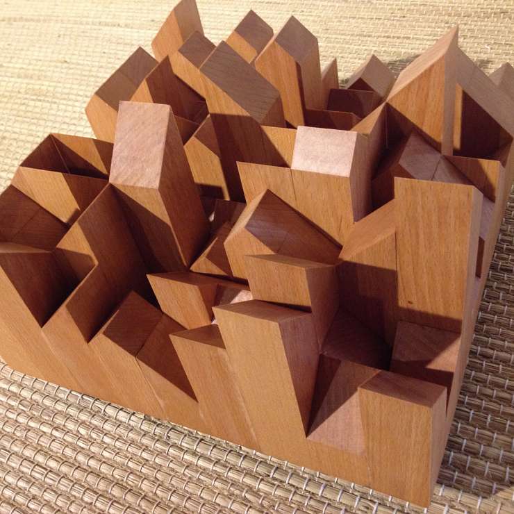
The projects ‘Karakters’ (‘Characters’), ‘Lines’ and ‘Mannen’ (‘Men’) are connected by a process of dematerialization: space becomes increasingly important while the elementary shape (the cube) remains visible. The point of departure for ‘Karakters’ are 4096 variations on the square (elaborated in the second and third dimension). All of these variants were drawn by hand individually, in order to be able to make an accurate selection.
‘Lines’ is an exploration through spatial structures where a selection of 30,000 structures has been taken from 3 million possible variants, all following a similar path along the edges of a composite cube. The starting point of the line is always on the front of the cube, and the finishing point is always the same position, on the top right hand corner on the back of the cube.
The project ‘Mannen’ is similar to ‘Lines’, and shares its point of departure of 4096 variations with ‘Karakters’.
As always Satijn was faced with a moment of choice during the work process for ‘Mannen’. He made a selection of 48 unique variants out of 700 possible seven-edged cubes. These 48 ‘men’ are all related to each other. They all measure 40 by 40 centimetres, contain 7 body parts and are made up of square steel profiles with a diameter of 50 millimetres. The men are all individuals, unique in their outward appearance. What makes them so fascinating is the fact that it is hard to describe their uniqueness, whereas their general features can be described quite easily.
Mathematical calculation and the magic of chance
He who seems to think that Satijn’s works are always heavy and serious and lack any sense of humour should have visited the installation ‘Huisjes’ (‘Little Houses’) during the manifestation ‘Dag van het Park’ (‘Day of the Park’) in Schiedam in May 2005. The artist was commissioned to exhibit visual art behind the windows of one of the town’s houses. He opted for an 18th century patrician’s mansion whose nine large windows in the symmetrical façade are subdivided into 256 small panes.
Satijn made 256 variations on the house as a child would draw it, whereby a form emerges in a pattern of continuing lines because the pencil doesn’t leave the paper. This house consists of eight lines. Satijn arrived at 256 variations by making binary choices: the line is there or it isn’t. This led to 28 = 256 variations. By colouring in some of the closed planes of the drawings the façade of the house was freshened up. The fact that the façade had exactly 256 panes to be used may have been a coincidence. But how can it be explained that each of these panes had exactly the same size as a sheet of A4 paper?
At a window installation for the exhibition at the Havendijk 80 gallery Satijn was once again confronted with a window division of 256 small panes. This time the basic figure he used is an open cube consisting of eight edges. Satijn selected 256 variants out of a total of 4096, and linked them into one long line across the interior façade of the house. The first position near one of the windows is a table-like construction, formed by a cube supported by 4 legs. Gradually all of the edges change position because one of these edges is turned 90 degrees. With the 256th variant the’ table’ is upside-down, mirroring the original position of the first table. It may be compared to a spatial comic strip where the first and the last images are antipodal. Because of the number of edges observed at one glance it becomes unclear to the beholder what it is that exactly changes. In spite of this, however, everyone experiences it as a harmonious whole.
Shape, sign and meaning: Homage to Jurriaan Schrofer
In 2004 Don Satijn and graphic designer Ad van der Kouwe presented an exhibition at the Pand Paulus gallery in Schiedam based on similarities and differences in the works of Satijn and those of Jurriaan Schrofer, a pioneer in Dutch graphic design from the fifties onwards.
Schrofer devoted his life to designing alphabets. Within the rules and matrixes he himself drew up he created abstract numbers and letters which he consequently used in complex figurations. It was never Schrofer’s intention to develop new ‘usable alphabets’. What fascinated Schrofer in his formal studies was the fact that abstract shapes may generate meaning. This happened when his alphabets were partly legible, or evoked associations in some other way. In this intention there is an obvious difference with Satijn’s work. Satijn also undertakes an exploration within a set number of rules (both Schrofer and Satijn worked with the same grid of 25 squares), but for Satijn the presence of meaning rules out the option of viewing the shapes as pure abstractions. Just like Schrofer Satijn had to conclude that even shapes that cannot be called numbers, letters or figures are able to evoke a certain meaning. For no viewer is able to look at the world in a totally unprejudiced manner. And just like there is no unchangeable intrinsic meaning, there is no complete freedom of value judgements or meaninglessness either. Fully aware of this, Satijn gave a series of formal studies based on the square the title ‘Karakters’. Don Satijn: ‘I gave names to some of the characters. This was based on the exploration into the phenomenon of meaning. As soon as you assign a word to an abstract formal composition its meaning has become inseparable. I’ve not pursued this any further, since I considered that connection too unequivocal. In general I believe that visual art should be open to interpretation.’
The Schiedam exhibition was a formal study in itself, based on grids used by Schrofer and Satijn, produced and filled in both two-dimensionally and three-dimensionally. Three installations placed in the heart of the room made it possible to experience the formal study also in a physical sense.
Coded meaning: lines and numbers
It is not a common sight in his oeuvre, but in the two series of ‘Barcodes’ Satijn used language. In this respect ‘Barcodes’ seems a sideline, even though two large series of 75 sheets each were made. ‘Barcodes’, however, is embedded in Satijn’s oeuvre because it explores the endless variation of line combinations. More importantly Satijn tried to open up the abstract nature of the barcode by adding meaning to it.
Barcodes consist of combinations of parallel lines with numbers underneath. The lines, along with the numbers, constitute a kind of PIN code. They are the bearers of information which remains inaccessible until the code is scanned. The relationship between the lines and the numbers is equally hermetic.
Satijn made two series of sheets based on the binary character of barcodes: a series of contrasting words and a series of contrasting (or related) abbreviations. Satijn felt that a field of tension needed to be created. When he would have used one single word per barcode, the result would have been simple labels. By means of the word pairs a meaning is assigned to the codes which is ‘legible’, but may also be confusing or even slightly threatening (IRA-RAF). The barcodes are taken out of their trivial context of the supermarket, or any other shop, for that matter. They have become works of art, which in turn pose their own questions.